8.28.2007
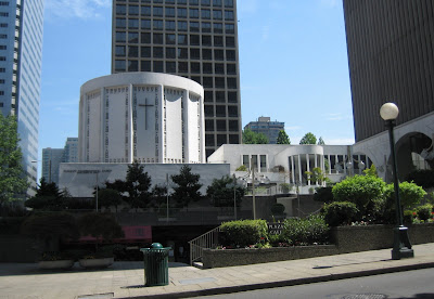
Church in the Round
I thought this was an interesting Church. Building in the round is more expensive, which is why we don't see a lot of round buildings. The details on this building also make it look like a chunky doily. It's definitely not delicate, but interesting nonetheless.
Downtown Seattle, WA
8.21.2007
Dynamic Leaves
8.19.2007
Gothic Faces?
8.18.2007
Gothic Revival Architecture
Trinity Church is the oldest church in Manhattan. This of course was not the first church building the congregation worshiped in because the church was founded in 1697, and this building was dedicated in the spring of 1846.
The cemetery is so old that most of the grave stones are worn away so they are unreadable or even broken.
The second picture reminds me of the drip sand castles I used to build on the beach. I never realized I was building a historic style sand castle when I was little.
Trinity Church History
Corner of Broadway and Wall Street.
8.17.2007
Mountain Retreat
It's an interesting hotel and it really speaks of a time when travel took longer, so this is really an "old money" resort for people from New York City before flights to Europe were easily accessible. The hiking, nature, and gardens really are the highlights, but the Mountain House is very nice too. Here you have the area by the water that looks like a log cabin and the rest of the hotel looks like the Victorian Castle that it is, with two distinct sides. The right side of the resort looks older and the left looks like it was built later.
New Paltz, NY
8.16.2007
Quasi-Neo-Classicism in New York
This building has neo-classical elements paired with the chunkiness of baroque forms and the harsh shapes and angles of elements that are american-art-deco-turned-social-realism. It is definitely one of the ugliest buildings I have seen. It's so ecclectic that it doesn't go with itself. There are cool bear faces on the side, but I didn't get a good picture of them, so I'll have to go back.
Financial District, Manhattan, New York City
8.15.2007
Neo-Classicism in Virginia
This is the public library of Winchester. The ecclectic neo-classicism has Corinthian columns on the front of the building and Ionic columns on the sides. The figures are well-proportioned and light, so they do not look like they were fashioned in a social realistic style, but they seem to have a bit of the American social realism message with the tools and the sphynx.
Winchester, VA
8.14.2007
It All Started With the Cows...
8.13.2007
What's The Meaning of This?
Where I live there is only ironwork (aka bars) on lower windows to keep thiefs and angry exes out. With this as my reference point I have no idea why they would only have ironwork on the upper windows, but it's an interesting design. I know there is probably some history behind it, or maybe it just looks nice, which is why I found it.
I love buildings with history, which is why I love the look of the old bricks and the Iron work on the windows of this building.
Winchester, Virginia
8.12.2007
Scary, But So Much Character
8.07.2007
The Original Logo Is Better!
Low key signage on the original Starbucks Store...
...neon and blackboard signs in the store, and...
...the plaque to signify that it is the original Starbucks.
I am not a huge Starbucks fan, so this was not really a pilgrimage for me. It did make me appreciate Starbucks more when I saw their original logo. It seemed a lot more local and fun than their current one, which has been neutered for corporate worldwide marketability. It was also a fun visit becuase the people who took the orders threw the cups across the counter to the baristas who were catching them one handed. The entertainment was a necessity though because we had to stand in line quite a while in the tiny store crammed in with a lot of people.
Pike Place Market, Downtown Seattle, Washington
8.06.2007
8.01.2007
Subscribe to:
Posts (Atom)