I saw this a month ago and had no idea what it was from the front, but then I saw the sign on the side where the restaurant is. It was originally designed in the 60's for the National Maritime Union.
9th Avenue & 16th Street
8.10.2011
4.30.2011
Native Americans in Seattle
I totally forgot to post these when I got home from Seattle because I was so busy.

These faces are on the Cobb Building which is now remodeled apartments. The building is on 4th Street, but I took the pictures from right outside the Rock Bottom Brewery on 5th. (That's the same location I photographed, and filmed this building sitting over top of me a couple of years ago.)
4.28.2011
Do You Want Your Building to Look Like a Dinner Plate?
If I remember correctly this is the model and plans for a Mercedes headquarter building in Germany. I think it's really interesting that it's essentially based on a dinner plate.
MoMA
4.26.2011
4.24.2011
4.23.2011
Another Crappy Phone Picture
Sorry, I like these faces though. This is somewhere on my walk between Lexington and 8th Avenue on 34th Street.
4.22.2011
NYU Element?
This looks like the NYU torch to me, but I don't know that this is an NYU building. It's right across the street from the Armory on Lexington near 25th Street. (I know the quality is not very good. I took the pics with my phone.)
4.21.2011
3.16.2011
Hotel Bar and Grill
This sign caught my attention after getting off the train in Hoboken, NJ.
There are so many little architectural details in Hoboken that are interesting I should go explore more. For the last five years usually I have only gone there after dark to go out to eat, or have been driving through, so I do not have many pictures.
3.14.2011
Painted Harlem vs. Unpainted Harlem
I'm not a big fan of painting brick. See the nice raw brick next door? But I did find it interesting that they took care to paint some of the details separately. This is a building they have fixed up on 134th street between Frederick Douglass and Adam Clayton Powell.
Here's the building next door that looks quite similar, but has more neutral colors. They're working on it now. I hope they don't paint the brick and details.
3.13.2011
Favorite Architectural Element of All Time
I am going back to Seattle this week, so I have been going through old pictures and have been reminded of the Walrus, which is still my favorite element after all these years!
3.12.2011
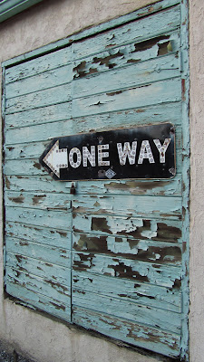
I Heart Peeling Paint!
...except when it's in my house and it has lead in it.
This is at Kirigin Cellars along with the barrel-door.
3.01.2011
50's Signage
I love old signs, and I saw a bunch in the Central Valley of California last week when I was visiting. I have no proof that this sign is from the 50's, but I think the font and the fading looks like it is from about that time period. It looks a bit art deco-y, which is why it caught my eye.
This is in Escalon, CA, which is right by Modesto.
2.27.2011
Wine and Cheese in Architecture
I love when form and function are unified seamlessly in architecture and design, but it's also fun to see when concept and function are played with. I don't even mind the cheesiness, (and the wine was pretty good.)
Here, in the Santa Clara Valley, at Kirigin Cellars the doorway to the wine tasting room is a large oaky barrel.
2.26.2011
Tolley Hall, Syracuse University
This building was designed in 1889. It has nice little details.
This guy looks very Romanesque~In art history class my friends and I created some mnemonic devices to remember these things. Grotesque Romanesque. And look, I remember it 13 years later! Have I really been out of college that long?
2.25.2011
Syracuse Mosaic
Syracuse University has an impressive amount of art on campus. Here is the one that grabbed my attention the most.
Bonus points to anyone who can tell me more about the artist/artwork here, or any of the artworks all over Syracuse's campus. Our tour guide gave me a very general answer. I was less than impressed.
2.24.2011
More Syracuse University
Very Classic: Nice red brick with Corinthian Columns. The frieze is a bit boring, but I like the eagle's feathers and his little legs sticking out of his "feather bellbottoms."
2.23.2011
Variety of Old and New
Syracuse University has quite a combination of old and new buildings. Their oldest buildings are all in the center of campus and then the surrounding buildings are from all different decades with the newest building being LEED Certified.
2.18.2011
2.17.2011
2.16.2011
2.15.2011
Delft Tiles?
Each fireplace in the Phillips Collection museum building is different, but the tiles on this one caught my eye. This section of the museum appears to be part of the newer section. I wonder if this fireplace was moved here from the older house, or if it is just one piece in the collection of artworks.
2.14.2011
Rothko Room! :(
I was so excited to arrive to the Phillips Collection and find that they had a Rothko Room! Rothko is one of my favorite artists, and I love sitting and enjoying his artwork for long periods of time. It was a wonderfully small room with a bench right in the middle for pondering the bleeding, layering, and movement of Rothko's paintings up close.
I was disappointed by two things: the lack of light in the room, and the loud creaky bench. I couldn't really see the undulating movement I normally look for in Rothko's work because it was just too dark. And every time I moved or adjusted my weight on the bench or someone came in to sit down to join me the bench made an awful, loud sound destroying my reverie.
Subscribe to:
Comments (Atom)


