Showing posts with label Signage. Show all posts

3.16.2011

Hotel Bar and Grill

This sign caught my attention after getting off the train in Hoboken, NJ. 
There are so many little architectural details in Hoboken that are interesting I should go explore more. For the last five years usually I have only gone there after dark to go out to eat, or have been driving through, so I do not have many pictures.

3.12.2011

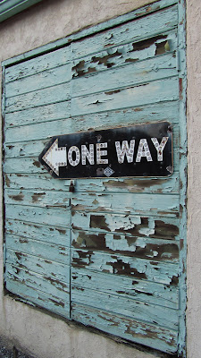
I Heart Peeling Paint!

...except when it's in my house and it has lead in it.
 This is at Kirigin Cellars along with the barrel-door.

3.01.2011

50's Signage

I love old signs, and I saw a bunch in the Central Valley of California last week when I was visiting. I have no proof that this sign is from the 50's, but I think the font and the fading looks like it is from about that time period. It looks a bit art deco-y, which is why it caught my eye.

 This is in Escalon, CA, which is right by Modesto. 

10.03.2010

Wrigley Field

Wrigley Field is quite unremarkable from the outside.

 This is what is known about the outside of the field.

I sent a picture like this to my brother during the game and he replied, "Where's the ivy? That's not Wrigley Field."

Here's the ivy and the old-school scoreboard.

Crappy plastic seats, but they were cheap for row 10!

Old-school cub. The style of the bear looks old even if the font doesn't.

The Cubbies won too, which was fun.

5.11.2010

Creative Signage

I wonder what kind of clothing they sell here?


I love it! Signs signifying items for sale without saying a word.

This is somewhere down in SoHo.

4.18.2010

Mmmmmm Signage!

My favorite fast food place!


I'm glad there are none of these in the east or I would weigh a lot more than I already do.

Manteca, CA

3.28.2010

The Architecturally Rough Side of Harlem


Harlem has such beautiful and historically interesting architecture...and it also has boarded up buildings, and buildings that are falling down. The sign on the overhang caught my eye, but I must go back to take another picture because it did not show up very well in the picture. I Still think the picture is interesting, so I'm posting it.

I think I was on Adam Clayton Powell Jr. Blvd. somewhere north of 135th and south of 144th

2.07.2010


Something draws me to this sign...I think because it hearkens back to days past, and it may be my whole thing with decay and imagining what things may have been like in their heyday.

6.11.2009

Neon Face


I have no idea who this is, and the colors look very 90's, but it is interesting nonetheless. It is on a building in downtown St. Louis.

2.08.2009

More Cute Signage


I love it. I may even put it on a t-shirt. The background is a preview of what is coming next as well. Views of the castle in Nürnberg.

1.05.2009

The Highlight of My European Tour


Sorry, it wasn't architecture...it was beer! Mmmmmm Weltenburg Dunkel.

11.11.2008

Signage

The first picture is from a Biergärten, then two images from Brauereien (Breweries) I was able to find, followed by two random signs that caught my eye while exploring Passau. Enjoy! I sure did.


8.22.2008

Sign Says...

you've gotta have a membership card to get inside.

Not really, it's an exit sign, but it could visually say that you need a membership card to get inside. Anyway, I like it.

7.25.2008

Signs Signs Signs

I have stumbled on some fun signs in the last couple days. Now that I look at these pictures again there are more signs in them than I focused on when I was taking the pictures. So this blog has a signing bonus.
The first two are from Clarkson Street, and the last one is from Broome Street.

I love the scale of this and the fact that it's a brick wall "painted" on a brick wall. Plus Batman: The Dark Knight is the talk of the town right now.


I love objects as signs, so a coffee cup letting me know there is a Dunkin' Donuts there makes me happy.


This sign is clever. It's for an eyewear store. Plus look at the detailed roll as architectural element at the edge of the building. Very nice!

6.13.2008

Miami Signs


I love typography and architecture, so here are two of my loves put together.

8.07.2007

The Original Logo Is Better!


Low key signage on the original Starbucks Store...


...neon and blackboard signs in the store, and...


...the plaque to signify that it is the original Starbucks.


I am not a huge Starbucks fan, so this was not really a pilgrimage for me. It did make me appreciate Starbucks more when I saw their original logo. It seemed a lot more local and fun than their current one, which has been neutered for corporate worldwide marketability. It was also a fun visit becuase the people who took the orders threw the cups across the counter to the baristas who were catching them one handed. The entertainment was a necessity though because we had to stand in line quite a while in the tiny store crammed in with a lot of people.

Pike Place Market, Downtown Seattle, Washington

6.08.2007

Custom-Made Sign


In Western Michigan they have the "Parade of Homes" where people pay money to go through new houses, and these are not just any new houses, but state of the art, amazingly huge new houses.

Here is a custom-made and designed sign from one of the builders involved in the Parade of Homes. I was impressed by the house of course, but I loved that the builder designed and made his own sign. I think it is a very classic sign that reflects the style of the builder.

Hudsonville, Michigan

4.21.2007

Signs That Don't (See Previous)


I love this first sign. It is so 50's. I'm not big into the 50's diner look, but this is a great look for a sign. (Even though part of it looks like it does light up. I didn't see it when it was lit.)

The second sign that caught my eye is the painted on on the brick pointing at a gift shops real sign and door. I love that it's fading away and that it's right on the brick. It makes it look old even if it's not.

These are both in the touristy section of Boston, MA.

4.20.2007

Signs That Light Up


Here are the signs by the Hirschfield Theatre. Since Broadway theatres are so close to Times Square it's hard to appreciate the lights "on Broadway." This sign of the man is simple and it lights up gradually, (which means I really should have a video here instead of a picture) but I really like that he is scratching his head while writing. The Hirschfield sign and the New Musical sign are not as visually intruiging to me, so I cut part of them off in the picture.

302 W. 45th Street